Hi Everyone! I'm finally back with my Remix layout. Quick catch up for newbies...Remix: From Card to Page is a feature on my blog where I design a card and then use that as inspiration for a scrapbook layout. Check out the Remix #2 card HERE.
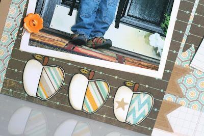
For this Remix I used the apple image (from Paper Smooches) as my inspiration. It all started with those 3 apples on the bottom of the page and then I built everything around it.
Since I only had one picture for this layout I decided to create two areas for journaling. The first journaling block is the quick story of my son's first day of preschool. The second spot includes lots of facts I thought would be fun to remember as the years go by. (details were blurred out for privacy)
The apples were paper pieced, inked, colored (stems and leaf). The star was stamped from Papertrey Ink's Banner Builder set. I also carried over the banner theme from my inspiration card and added several stamps banners to the layout (also from Banner Builder).
Finally, the title that brought my layout to a screeeeeeching halt. :) It was only after receiving my Creating Keepsakes magazine that I realized I was TOTALLY over thinking it. I found some chipboard letters in my stash and added a layered heart (using PTI dies) stamped with my favorite Woodgrain Hero Arts stamp.
I would love to hear your feedback on Remix #2! Have a great day!


Comments
All of the fabulous little details. I am envious! :)
What a great idea to take a card and "remix" it into a scrap page.